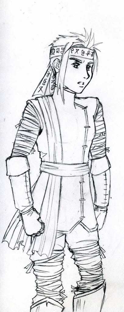
Author Topic: <Untitled IAQ Project> Aesthetics musings  (Read 7828 times)

DjinnAndTonic

  • Genie and Potion with Alcoholic Undertones
  • DL
  • Denizen
  • *
  • Posts: 6939
  • "When you wish upon a bar~"
    • View Profile
    • RPGDL Wiki
Re: <Untitled IAQ Project> Aesthetics musings
« Reply #25 on: March 30, 2010, 08:09:16 AM »
MOAR SKETCHES!


Claire: simple pose
Notes: Same basic uniform as Ilona. Claire wears gloves, and has a skirt instead of duster. Also, instead of shirt like Ilona, Claire opts for a leotard thing.


Claire: hair details
Notes: Claire's hair is pale pink, by the way. Her braid is actually a fashion accessory, since she's been wanting to be a Guardian for so long. But she's 17, so she only just joined the Guardians last year. I have a lot of her hair covering up her face since she's supposed to be a little shy.


Fahim: pose
Notes: My first picture of Fahim. Originally, he wasn't wearing the God-King sash and it looked -really- gay. Too much exposed midrift + gay arm-thingies. The sash covers up more midrift, which makes it more tolerable, but I couldn't change the sleeves in this picture. Still, this -basically- what he looks like once he gets the sash from the GKs.

Also, yay, he's cast magic or something.


Fahim: design sketch
Notes: More static picture. I opened the jacket on his uniform, which makes it look about a billion times less gay. Remember kids, bare midrift=gay; barechested=MANLY. He picked up a skintight top which shows off some midrift because he's supposed to be any kind of bastion of manliness anyway >.>;; Still, the effect works in making him look less effeminate. Also, changed the arm-thingies from flaired sleeves to more like cloth arm-guards. He stills shows off a lot of skin since this is supposed to be a tropical climate (especially where the Academy is), but I tried to make the outfit a little more masculine in general, since this is also the template for Academy male dresscode.

I think it works overall.


Hunter Sopko

  • Heavily in Debt
  • DL
  • Denizen
  • *
  • Posts: 4556
  • Hai, Kazuma-desu
    • View Profile
Re: <Untitled IAQ Project> Aesthetics musings
« Reply #26 on: March 31, 2010, 04:28:51 PM »
There's something about Fahim that makes him look about 12-14. I think it's the roundish face. Just noting this, as I don't know if it's intentional or not.

DjinnAndTonic

  • Genie and Potion with Alcoholic Undertones
  • DL
  • Denizen
  • *
  • Posts: 6939
  • "When you wish upon a bar~"
    • View Profile
    • RPGDL Wiki
Re: <Untitled IAQ Project> Aesthetics musings
« Reply #27 on: April 01, 2010, 04:36:36 AM »
Well... he -is- the youngest male in the cast. I was going for 'looks 18', not 'looks 14' though... >.>;;

Perhaps being in Japan has skewed my perception of aging though.

Hunter Sopko

  • Heavily in Debt
  • DL
  • Denizen
  • *
  • Posts: 4556
  • Hai, Kazuma-desu
    • View Profile
Re: <Untitled IAQ Project> Aesthetics musings
« Reply #28 on: April 01, 2010, 04:49:44 AM »
Maybe. You could probably keep the face looking the same if you nulked him up a bit or lengthened the legs and chest (Keeping the head in proportion of course). A babyfaced character would be pretty amusing if it's played for comedy.

Excal

  • Chibi Terror That Flaps in the Night
  • DL
  • Denizen
  • *
  • Posts: 2603
  • Let's Get Adorable
    • View Profile
Re: <Untitled IAQ Project> Aesthetics musings
« Reply #29 on: April 02, 2010, 11:10:34 PM »
Great, now I'm imagining using Fahim in tavern scenes to not only mock his youth, but also the many things alcohol has been changed to in NA translations.

"Well to the Guzzling Hog, good travelers.  We've got a fine Ale on tap, and some Soda for your friend there."

DjinnAndTonic

  • Genie and Potion with Alcoholic Undertones
  • DL
  • Denizen
  • *
  • Posts: 6939
  • "When you wish upon a bar~"
    • View Profile
    • RPGDL Wiki
Re: <Untitled IAQ Project> Aesthetics musings
« Reply #30 on: April 09, 2010, 08:04:25 AM »
Some more sketches, getting a handle on things.


Isolde Official Art
A proper look at Isolde, one of our main characters. I can't believe it's taken me this long to actually draw a full picture of her. And it's not nearly as dramatic as it could be... but I wanted to get handle on how her outfit works with all the details first. And yes, Isolde is pretty much the only :ahem: ...endowed member of our cast. I'm debating whether or not I want to change that.


Noemi 'Game Coverart' Idea
This one is a work in progress, really. I'd been mentally thinking that I wanted to try fleshing out my designs. Thus far, I've been drawing characters and outfits in a somewhat simplified manner. Normally when I make new characters I think "I need to concentrate on the major shapes that define a character's look, and leave out details like embroidery and excess bangles... after all, I'm going to have to draw these characters over and over again and those kind of details are easy to forget."

However, I wanted to start adding in those kinds of details and personal affects. Those little things can really make a difference in adding a fantasy element to a design. Thus, this picture is the start of trying that with Noemi's design. I haven't done anything with her sleeves and leggings yet, but you can get an idea of what I'm talking about with the detail added to her top, the choker piece, the added waist sash, the extra detail in her hair. I have a bunch of other things I want to add, but I wanted to scan this now in case I messed it up with my crappy art supplies (I can only erase so many times before the picture is unuseable... just look at the left side of her face ;_; ).

In case you're wondering what the hell she's doing, she's supposed to be holding a big old zweihander sword in the finished product. This particular pose was something I imagined as using on the Boxart for the 'Game'.

AndrewRogue

  • Infinite
  • DL
  • Denizen
  • *
  • Posts: 3079
  • Sadness
    • View Profile
Re: <Untitled IAQ Project> Aesthetics musings
« Reply #31 on: April 13, 2010, 08:21:38 AM »
Belated commentary since I can't believe I forgot to mention this.

Isolde looks pretty brilliant on the whole. Her weapon needs a slight bit of work (or the effect of foreshortening and perspective are really wonky) but, on the whole, she looks great. I could do with a slightly heavier outfit by default (or we deny her heavy armor >> ) but really, its a good look. Fairly dynamic,  serious, convincing.

Noemi looks good, as always, lately. Looks like you're getting a really great handle on the design. Details are the magic and I'm curious to see what you'd come up with. Would like to see the full piece.

Hunter Sopko

  • Heavily in Debt
  • DL
  • Denizen
  • *
  • Posts: 4556
  • Hai, Kazuma-desu
    • View Profile
Re: <Untitled IAQ Project> Aesthetics musings
« Reply #32 on: April 13, 2010, 09:27:38 AM »
The Isolde one looks effing fantastic. Might want to erase that chin-line a bit more though if thats not supposed to be there.

The Noemi one is great too, at least characterwise. Her design is getting refined and the details on the clothes are good. But the positioning looks... off. Her left hand looks like it's playing some sort of instrument, and if you stuck roller blades on her she could be doing some sort of badass jump right out of Air Gear.

DjinnAndTonic

  • Genie and Potion with Alcoholic Undertones
  • DL
  • Denizen
  • *
  • Posts: 6939
  • "When you wish upon a bar~"
    • View Profile
    • RPGDL Wiki
Re: <Untitled IAQ Project> Aesthetics musings
« Reply #33 on: April 19, 2010, 02:43:53 PM »


Throwing some ideas around with photoshop. Looks pretty unrefined right now, but better than the pencil sketch I originally had. Need comments and suggestions on colors, text, positioning, and how much information to display at once (and how). All sprites were taken directly from Charas Maker and FaceMaker. This can all be done later, I'm just throwing it out here for now.

Excal

  • Chibi Terror That Flaps in the Night
  • DL
  • Denizen
  • *
  • Posts: 2603
  • Let's Get Adorable
    • View Profile
Re: <Untitled IAQ Project> Aesthetics musings
« Reply #34 on: April 19, 2010, 11:43:32 PM »
Hmm, with the asymetrical display, I'd say having the battlefield off-centre is a better idea than centreing it.  Otherwise, works.

dude789

  • Denizen
  • *
  • Posts: 1284
    • View Profile
Re: <Untitled IAQ Project> Aesthetics musings
« Reply #35 on: April 20, 2010, 03:55:41 AM »
I'm not a fan of the mint green grid and character stats. I'm not sure how good transparent hexs would look, but I think we should definately choose a more neutral color. The blue for the movement selection is alright though. I think an FFTesque color scheme for moving and targeting could work with blue being movement, red being targeting, and yellow being area of effect.

Dark Holy Elf

  • Moderator
  • Denizen
  • *
  • Posts: 8135
  • Well-behaved women seldom make history
    • View Profile
Re: <Untitled IAQ Project> Aesthetics musings
« Reply #36 on: April 20, 2010, 04:07:17 AM »
I was kinda assuming the mint green on the hexes was a standin for whatever textures end up being used.

What's the maximum number of characters that can fit in a hex? The current art already makes it look like 3 is pushing it.

Erwin Schrödinger will kill you like a cat in a box.
Maybe.

Hunter Sopko

  • Heavily in Debt
  • DL
  • Denizen
  • *
  • Posts: 4556
  • Hai, Kazuma-desu
    • View Profile
Re: <Untitled IAQ Project> Aesthetics musings
« Reply #37 on: April 20, 2010, 05:58:42 AM »
I would imagine it'd be tough to pull off, but if you make it adjustable zoom, then it might fix the awkwardness problem for the amount of people in a hex

DjinnAndTonic

  • Genie and Potion with Alcoholic Undertones
  • DL
  • Denizen
  • *
  • Posts: 6939
  • "When you wish upon a bar~"
    • View Profile
    • RPGDL Wiki
Re: <Untitled IAQ Project> Aesthetics musings
« Reply #38 on: April 20, 2010, 10:46:23 AM »
I was kinda assuming the mint green on the hexes was a standin for whatever textures end up being used.

What's the maximum number of characters that can fit in a hex? The current art already makes it look like 3 is pushing it.

Don't assume these things. Things like "Oh that color is obviously just a stand-in" "Oh, Djinn knows what he's doing" are not good to assume when it comes to menu design.


And uh... maximum number of PC-sized things in a hex was supposed to be 4, with smaller enemies being up to 6, IIRC. Yeah... I guess I made everything too small... >.>;;

Note that color, sizing, and moving things around are the -easiest- things to change, so don't hold back in giving me opinions there. It's making up new shapes for boxes or something that takes time.

DjinnAndTonic

  • Genie and Potion with Alcoholic Undertones
  • DL
  • Denizen
  • *
  • Posts: 6939
  • "When you wish upon a bar~"
    • View Profile
    • RPGDL Wiki
Re: <Untitled IAQ Project> Aesthetics musings
« Reply #39 on: April 23, 2010, 11:19:19 AM »
Yay, fun art timez!


Shao Portrait

Man, I love his hair. Anyway, he's fully-covered like a good barbarian should be. However, to show some deference to the nice Imperials who let him in the Imperial Research Academy (to spy on them!), he wears the school uniform and covers up with bandage-y wraps. He should also have an emblem on his GK sash, but I have no idea what it should be. Presumably some kind of animal, but I don't know which animal Shao's tribe represents.
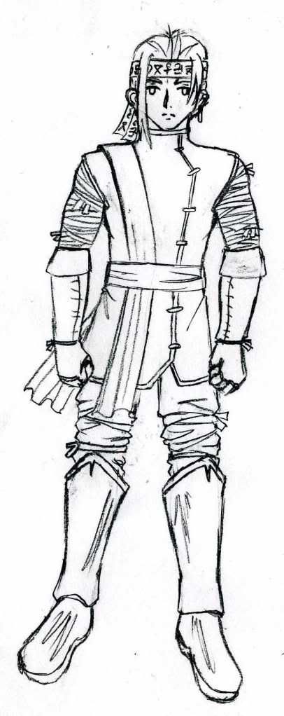

Shao Design

A clearer look at the outfit, though I don't like how the hair turned out as much.


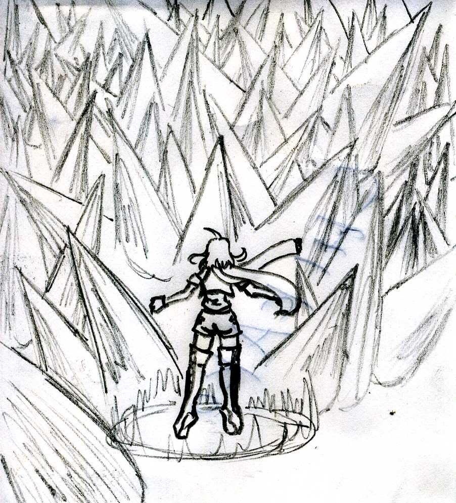
Isolde's Magna Phalanx concept art
Because Nama's talked about it so much, it actually gave me a very clear image of what this should look like, so I sketched a quick doodle of it. Remember Nama, your ramblings are helpful~
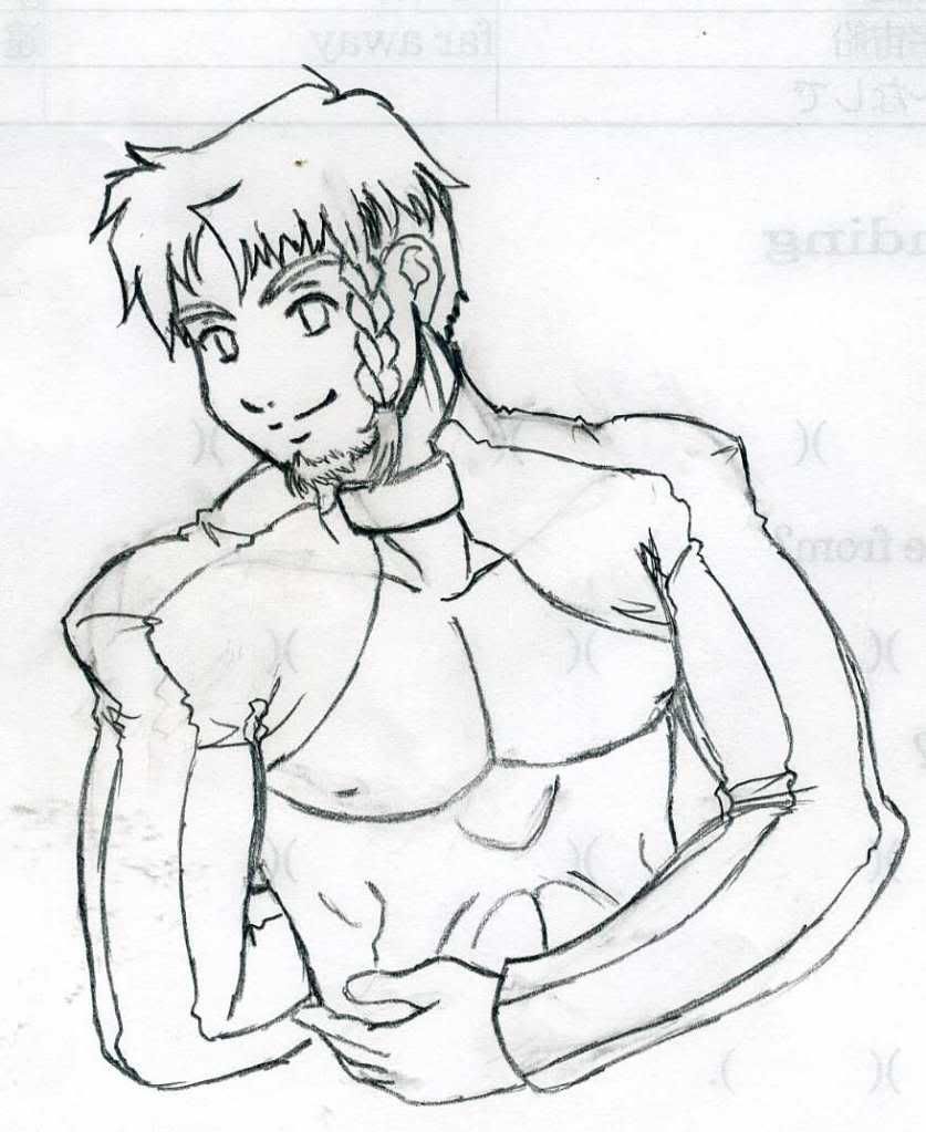


Mirek Portrait

A proper portrait of everyone's favorite emo Guardian. This particular picture strikes me either as 'young, not-yet-disillusioned Mirek' or 'learned-to-trust-again' Mirek. At some point I need to draw him all dark and moody. You'll know he's 'broody Mirek' if he's wearing a big ol' tattered cloak. Symbolism or something, yo.
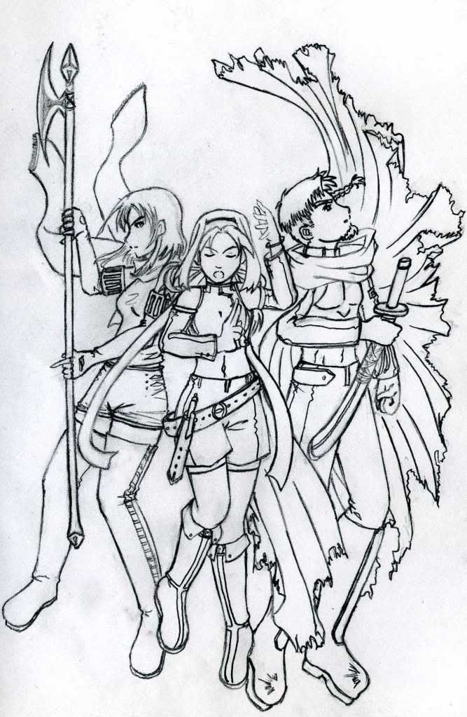

Main Trio Promo Art

Hey, I do actual pictures and not just sketches sometimes! I'm pretty pleased with how this turned out overall, but it's nothing spectacular. Still, I may color it and use it to make the wiki look pretty.

It's also our first look at Mirek's broody cloak! Story-wise, he wears it to hide his Guardian armor-pieces from being -too- obvious. Symbolically, he's hiding himself and trying to lose himself in an oversized garment. Pick whichever one offends your artfag senses the least.

Noemi's hair needs to pick a length.

And yes, they're all randomly floating. Blame magic or something. It's totally not because the artist misjudged their heights or anything like that where it's my fault.

Yoshiken

  • Denizen
  • *
  • Posts: 2068
  • Yay!
    • View Profile
Re: <Untitled IAQ Project> Aesthetics musings
« Reply #40 on: April 23, 2010, 12:23:11 PM »
Dammit, Djinn, let me steal your drawing skills. ;_;

By which I mean those last few pieces in particular are amazing. I love the first Shao one (the hair IS awesome!) and the official art trio one is cool. I still can't help but laugh at the fact that Mirek has practically nothing in the way of armour, but... well, gaming logic.

Seriously, looking over it again, I'd say those two are probably the best ones I've seen in this topic so far. Nice work. ^_^

DjinnAndTonic

  • Genie and Potion with Alcoholic Undertones
  • DL
  • Denizen
  • *
  • Posts: 6939
  • "When you wish upon a bar~"
    • View Profile
    • RPGDL Wiki
Re: <Untitled IAQ Project> Aesthetics musings
« Reply #41 on: April 26, 2010, 05:58:16 PM »
Had some genuine freetime during work, but I was utterly uninspired. I decided to force some sketches out, but they're mostly crappy. Uninspired freetime is good for finishing detail work, but doesn't produce the best original designs. Still, maybe they can give an idea of the remaining PCs.


Artur (maybe?) concept
This is what I've been envisioning for Artur so far, but once I put it on paper, it looks a lot more military than I expected. It might suit Aurel better as a result... or possibly even the new Josef character? Thoughts?


Orienna concept
Crappy picture, but I kind of like the basic hairstyle. One large braid, one smaller braid. Kind of fun to draw.


Rafael concept
Yeah, he's pretty young-looking. No clue what kind of outfit he should wear.


Selena concept
Proportions are all off, but I like the hairstyle.


Noemi Cover - color
Y'know, I almost had the background for this finished when Adobe crapped out on me. *sigh*

Still, the colors turned out nicely enough. And the sword was the one detail I managed to finish during my freetime today, so I think it turned out pretty well! Has kind of a tuning-fork theme going on with the hilt. Guess it works.

I still intend to make this a cover image somehow.

DjinnAndTonic

  • Genie and Potion with Alcoholic Undertones
  • DL
  • Denizen
  • *
  • Posts: 6939
  • "When you wish upon a bar~"
    • View Profile
    • RPGDL Wiki
Re: <Untitled IAQ Project> Aesthetics musings
« Reply #42 on: June 29, 2010, 08:50:29 AM »
Been a while and I really don't have much to show for it.


Eirwen, full portrait:
I'm happy with how she looks here: obviously young and anime-styled, but I tried not to go too overboard with it.  Her breasts are looking a little smaller than intended, too, but that's mostly because her hand's in the way. Still, she fulfills the role of fanservice design without looking too out of place among the cast. I want to color this, but I wonder how well her black hair will translate to a colored version.


Aurel:

Aurel is badass and has a shaved head. He also look really young. I like this image. Not really sure how well the style meshes with the rest of the sketches I've done, though. I might try to draw more future sketches like this instead of vice-versa.

OblivionKnight

  • Boom! Big reveal: I'm a pickle. What do you think about that?
  • Global Moderator
  • Denizen
  • *
  • Posts: 2999
  • I'm Pickle Rick!
    • View Profile
Re: <Untitled IAQ Project> Aesthetics musings
« Reply #43 on: June 29, 2010, 10:31:51 AM »
Does the carpet match the drapes?
[11:53] <+Meeple_Gorath> me reading, that's a good one

[19:26] * +Terra_Condor looks up. Star Wars Football, what?
[19:27] <+Terra_Condor> Han Kicks First?
[19:27] <%Grefter-game> Vader intercepts.
[19:27] <%Grefter-game> Touchdown and Alderaan explodes in the victory

DjinnAndTonic

  • Genie and Potion with Alcoholic Undertones
  • DL
  • Denizen
  • *
  • Posts: 6939
  • "When you wish upon a bar~"
    • View Profile
    • RPGDL Wiki
Re: <Untitled IAQ Project> Aesthetics musings
« Reply #44 on: June 29, 2010, 10:44:22 AM »
What carpet?  ;D

Excal

  • Chibi Terror That Flaps in the Night
  • DL
  • Denizen
  • *
  • Posts: 2603
  • Let's Get Adorable
    • View Profile
Re: <Untitled IAQ Project> Aesthetics musings
« Reply #45 on: June 30, 2010, 08:45:22 AM »
You two should be ashamed of yourselves.  Aurel deserves better than demeaning commentary like this.

DjinnAndTonic

  • Genie and Potion with Alcoholic Undertones
  • DL
  • Denizen
  • *
  • Posts: 6939
  • "When you wish upon a bar~"
    • View Profile
    • RPGDL Wiki
Re: <Untitled IAQ Project> Aesthetics musings
« Reply #46 on: July 01, 2010, 04:25:09 AM »

More pics


Orienna portrait

A more complete look at Mirek's poor-tempered ex. My eraser didn't work for this, so there's a lot of extra lines... Sorry.


Eirwen Mini-Pic

I just wanted to draw some action poses and I didn't have a lot of time, so I made them super-small. Eirwen's an action chick, clearly. Knife-throwing is badass.


Kasia Mini-Pic

Kasia has a whip! Look out!


Isolde's branding

Drawn entirely to show that Isolde has her military tattoo under her sleeves. I detect a hint of disgust in her expression.


Josef: First look

Getting a design down for Josef. Yes, I modeled him after Mirek, only a bit older. I figure that Josef kinda took Mirek under his wing when he joined the Guardians and Mirek just kind of subconsciously copies him due to how much he respects Josef. Josef is by far a stronger father figure influence on Mirek than Erastus. I find this to be interesting, so I'm working it directly into my character designs.

DjinnAndTonic

  • Genie and Potion with Alcoholic Undertones
  • DL
  • Denizen
  • *
  • Posts: 6939
  • "When you wish upon a bar~"
    • View Profile
    • RPGDL Wiki
Re: <Untitled IAQ Project> Aesthetics musings
« Reply #47 on: July 01, 2010, 07:08:52 AM »
And another one.


Eirwen and Mirek sketch

The entire point of this picture is so that Eirwen can be ^_^.

DjinnAndTonic

  • Genie and Potion with Alcoholic Undertones
  • DL
  • Denizen
  • *
  • Posts: 6939
  • "When you wish upon a bar~"
    • View Profile
    • RPGDL Wiki
Re: <Untitled IAQ Project> Aesthetics musings
« Reply #48 on: July 01, 2010, 08:01:35 AM »
More still


Eirwen portrait - sad

A slightly larger image of Eirwen's outfit that you can hopefully understand how all of it comes together. Also, sadface Eirwen always has more hair in her face because it's cute.

DjinnAndTonic

  • Genie and Potion with Alcoholic Undertones
  • DL
  • Denizen
  • *
  • Posts: 6939
  • "When you wish upon a bar~"
    • View Profile
    • RPGDL Wiki
Re: <Untitled IAQ Project> Aesthetics musings
« Reply #49 on: July 06, 2010, 10:47:41 AM »
Cleaning up the facemaker portraits so that they actually look like the characters. It takes a while since I have to customize a lot of stuff.

Noemi and Mirek. I had to specially create the hair, ribbon, beard, and braid. And then clean up the images so they weren't all pixellated. Took all day. *sigh*

Originals:
« Last Edit: July 07, 2010, 02:50:52 AM by DjinnAndTonic »